


Prior to 2022, attaining digital renderings of our planet’s geology has been a lengthy and arduous task. Mapping company Esri has recently changed that, creating an interactive timespan of the globe between 2017 to 2021.
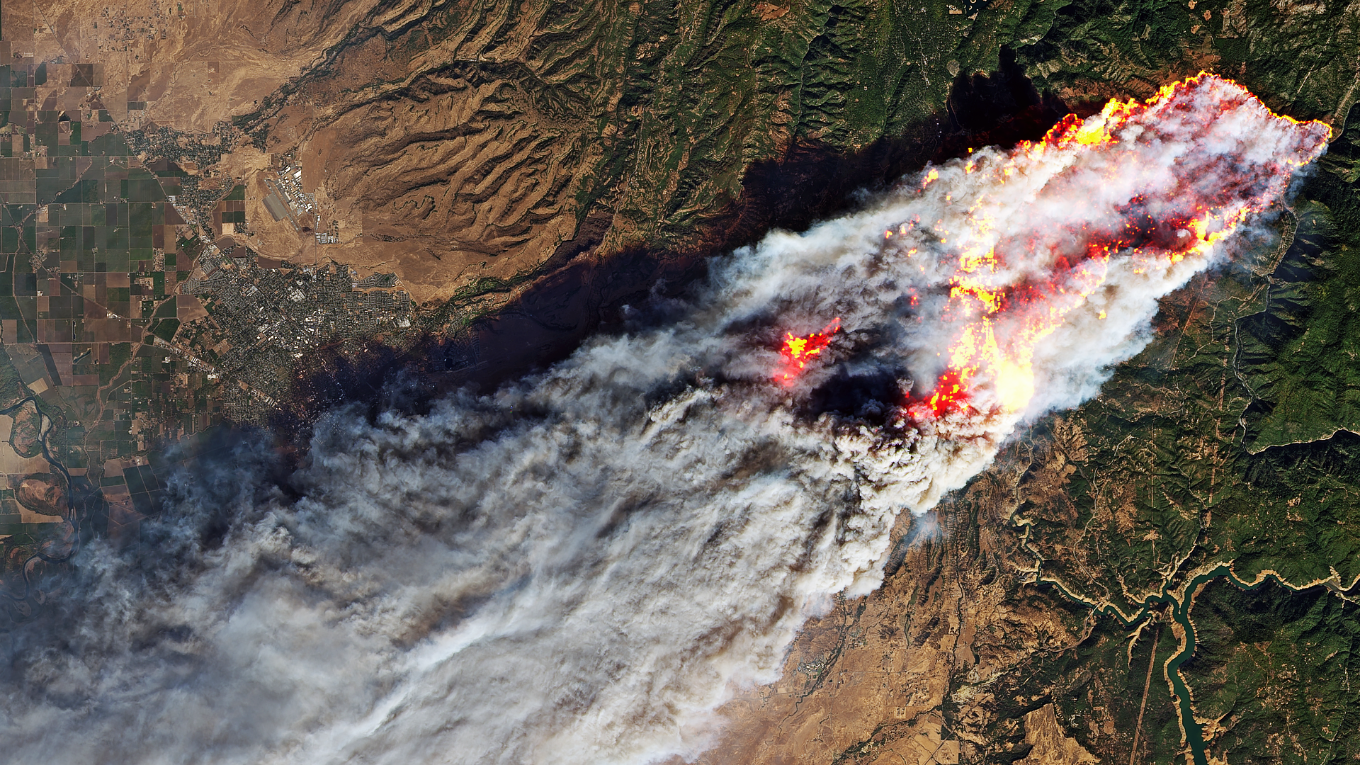
As huge parts of the world endure record heatwaves courtesy of climate change, we’re left to ponder where the planet will be in decades to come.
The good news is that we can now digest our existential crisis more accurately, using an interactive map with a visceral timespan feature. Yipee.
In all seriousness, the limitations of satellite imagery have held us back for some time now. Land mapping usually has to be etched out pixel-by-pixel and requires a lengthy process of review, meaning that when we we’re finally presented with digital images, responding to findings is usually too late.
From this point on, however, getting an Earthly overview should entail far less upheaval.
That’s because a mapping company called Esri has been creating detailed renderings of our planet using artificial intelligence to quickly crunch through satellite data. A procedure that once took months or years to bear fruit can now be processed in around a week.
In cahoots with Microsoft – which provided the server capacity – and the Impact Observatory’s findings, it has created the basis for a far more sophisticated future of disaster management and real time climate change data.
As a demonstration of the technology, it has released an online feature called Living Atlas of the World. This allows users to scroll through an interactive timelapse of the planet between the years of 2017-2021, pausing and zooming at 26 different points.