Burger King is the latest big-name franchise to adopt a new ‘flat’ logo. It’s part of a rising graphic design trend that appeals to Gen Zers and mimics the slick style of social apps.
The popular fast food chain Burger King has just unveiled its latest branding redesign and it’s about as clean, minimal, and flat as you’d expect from a big name in 2021.
It follows in the footsteps of Netflix, Instagram, Petco, and many others that are embracing the stripped-back look.
An increasing number of companies are adopting ‘flat design’ philosophies into their marketing and logos, attempting to imitate the simplistic styles made popular by iOS design and social media apps over the last decade. It does away with the flashy, in-your-face graphics that plastered many noughties posters and interfaces, instead focusing on bulk shapes and soft lettering.
This direction is primarily to appeal to tech-savvy younger consumers that have become accustomed to mobile interfaces and demand easy-access information on an immediate basis. If you’re curious as to what ‘flat design’ really is and how it’s shaping the digital design landscape, we’ve got you covered – you’ll be a graphic designs trend expert after this.
What is flat design and why are companies using it?
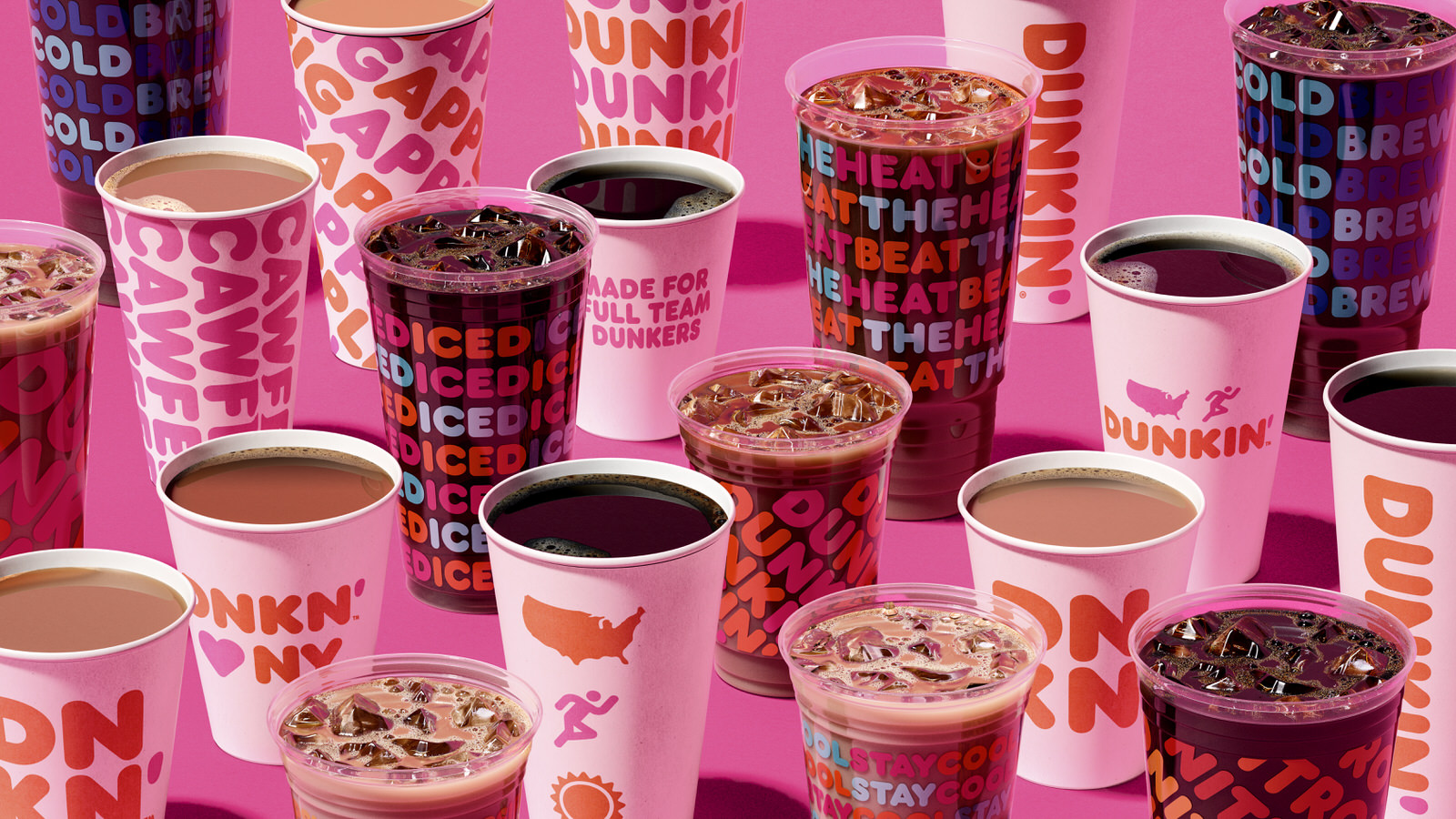
Put simply, flat design almost exclusively uses two-dimensional shapes and tries to minimise noise wherever possible. Bright colours and easy to understand messaging are key to flat design, which can be seen everywhere from Dunkin’ Donuts to Windows 10.
In a hyper-active and over-stimulated market, flat design is essential to grab the attention of viewers. Gen Z in particular have become accustomed to absorbing information constantly and branding strategies need to keep up with this intense flow of traffic if they want to stay ahead.
Reducing logos to their essential elements is also handy for smartphone optimisation and screens of all sizes, making a company more accessible in the digital age. The simpler the design, the easier it is to recognise – even when only a few pixels large on a tablet or iPhone.
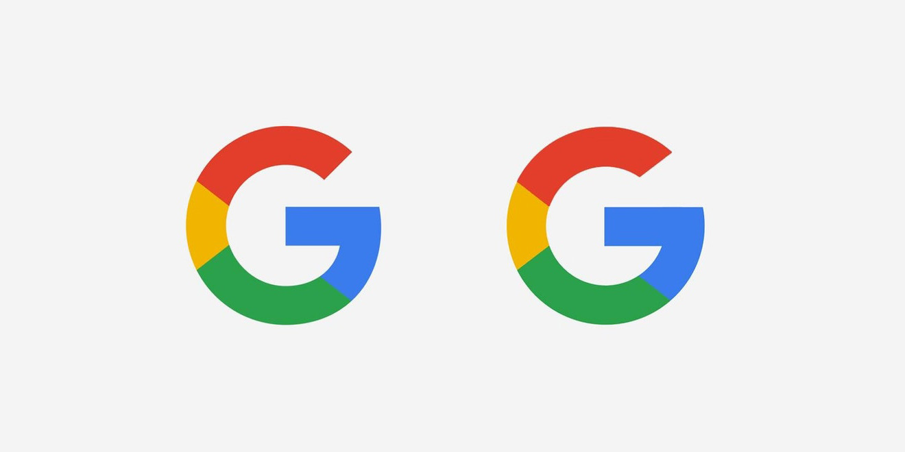
Google’s switch up of its main logo utilised this benefit of flat design and now uses a simple ‘G’ that can be plastered pretty much anywhere. Facebook also dropped its square edges and went with a circular, more brightly coloured design a few years back and Instagram did away with its original polaroid logo that looks archaic today in comparison. Not that the internet didn’t complain like hell at the time, mind.
Today, in the constant internet access, lockdown pandemic hellscape that is 2021, advertisers must consider their digital reach and retention above all else.
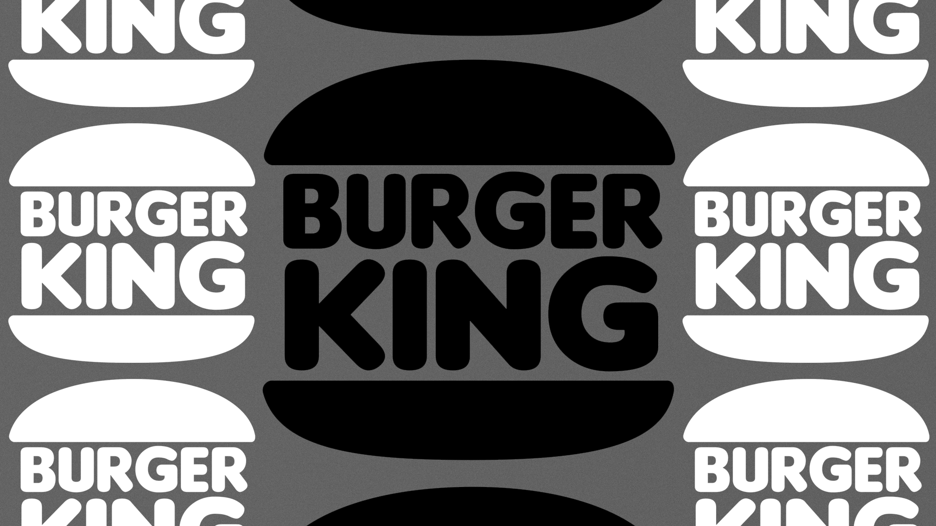
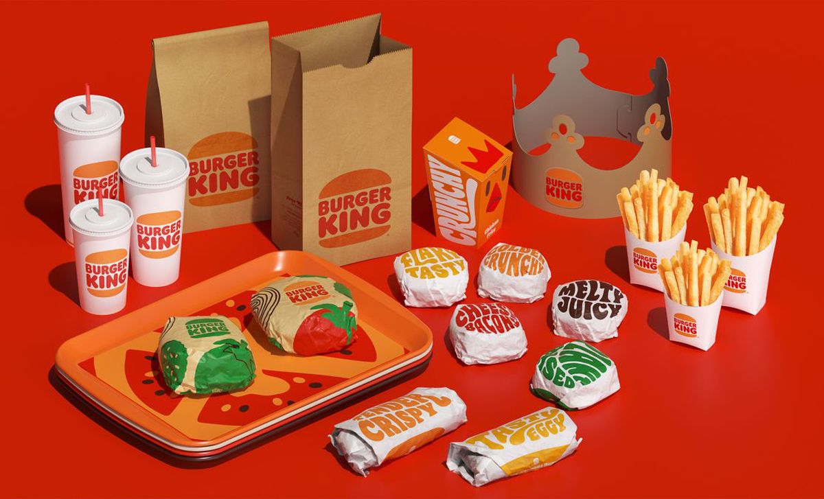
Burger King’s rethink of its logo reflects an evolution in needs – no longer is it just trying to entice customers off the streets or via their televisions, but rather through online social media advertisements. Services like Uber Eats and on-the-go takeaways have also compounded this intensity further.
Burger King has invested significantly in its own mobile and online platforms too, which are already halfway through this rebrand transition. Its choice of typography and geometrically conscious layouts suggest the company is trying to make its online presence as smooth and translatable as possible.
How long is the trend likely to last?
Trying to calculate how long a trend like this will last is borderline impossible, though experts have noted flat design and its growing popularity since around 2013. It seems to have directly correlated with Apple’s iOS 7 interface rebrand, which oozed flat design in every corner of its UI.
You can bet that while social media apps and smartphones remain the top dogs of content consumption, flat design is likely to stay. We have thoroughly shifted away from the flashy, novelty graphic indulgences of the late nineties and noughties and simplicity reigns, at least for now.
Until Gen Z moves from being the biggest pool of long-term revenue for companies, don’t expect things to change dramatically anytime soon. We may have to wait until Apple decides to re-invent its interfaces all over again before things switch up significantly.
I’m the Editor In Chief at Thred. I studied English at the University of Birmingham and as a music and gaming enthusiast, I’m a nerd for pop culture. Follow me on Twitter, LinkedIn and drop me some ideas/feedback via email.
Over 8.3 billion tons of plastic has been produced in the last 70 years, yet only 8% is recycled. Here are five activists putting excess plastic to good use.
Plastic pollution has increased at an exponential rate over the years, causing devastation for wildlife and ecosystems both on land and underwater, as well as impacting human health.
According to Greenpeace, since the 1950s over 8.3 billion tons of plastic —...
Scientists have managed to achieve two-way communication with lucid dreamers for the first time. Specialists are now drafting up a whole new avenue for dream analysis.
While it’s hard to find value in listening to a family member or colleague’s subconscious adventures from the night before, understanding the hallucinatory world inside our dreams remains high on the bucket list for both neuroscientists and psychologists alike.
Understanding the meaning behind our dreams...
Despite our hopes for the vaccine, restrictions on our social lives seem to loom indefinitely. New collaborative architecture firms have proposed social distancing-friendly performance venues to keep things afloat.
By this point, it is no surprise that social distancing laws have had a devastating financial impact on public venues, despite their positive effect on slowing virus transmission.
One of the worst-hit areas has been the entertainment industry, which relies on...
A new project called TECLA uses recycled materials and zero waste to 3D print entire houses. There’s a lot to love, but I’m still trying to figure out how you’d hang pictures on the wall.
Ever wanted to live in an igloo, but not a fan of the cold?
You might want to check out these new dome-like dwellings currently being developed under the title ‘TECLA’, each one entirely 3D printed....