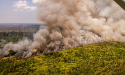
As wildfires continue to ravage California, Oregon, and Washington, climate experts are utilising data tools to double down suppression efforts.
As you’re reading this more than 85 fires are raging across California, Oregon, and Washington. Amber skies hang above the parts of the region as some 3.1 million acres are destroyed, forcing entire communities to either evacuate their homes or contend with the most toxic air quality in state record.
Igniting around a month ago, the much discussed the El Dorado Fire began when a family used a ‘pyrotechnic device’ during a baby gender reveal, but several fire departments across neighbouring states have also cited bizarre dry storms, high winds, and severed powerlines as contributing factors.
At least 12 people have been reported dead with close to 4,000 structures destroyed already, and the wildfire season of Autumn – which is stretching year on year according to scientists – has only just begun. Those fortunate enough to be outside the immediate path of these blazes are largely confined to their homes with toxic smoke filling the streets. The great outdoors isn’t providing much respite for citizens of the Golden State in 2020, who are even now being forced to contend with the Coronavirus.
The 2020 fire season has been record-breaking, in not only the total amount of acres burned at just over 3 million, but also 6 of the top 20 largest wildfires in California history have occurred this year. pic.twitter.com/CmmhH5wTVX
— CAL FIRE (@CAL_FIRE) September 10, 2020
The role of user technology
While experts are stumped at the sheer acreage of these fires across a variety of different ecosystems, with climate expert Daniel Swain stating that he’d ‘run out of superlatives’ to describe the situation, technology is refining the efforts of emergency responses whilst keeping those affected in the know through some pretty innovative ways.
Developed by spatial analytics firm Esri, a Wildfires Story Map allows people to search for active wildfires by name or by zooming into specific hotspots, with impacted areas of at least 190,000 acres denoted by glowing orange bulbs. Regular updates on state containment efforts, local evacuation orders, and again ‘fires by location’ are available on Cal Fire (California), The Department of Forestry (Oregon), and the Northwest Interagency Coordination Center (Washington).
Those concerned about air pollution have equipped themselves with a few canny apps to monitor their immediate bubbles on a day-to-day basis. Headed up by the Environmental Protection Agency, an app called AirNow displays each area relative to the Air Quality Index and the rules are simple: the higher the number, the worse the air quality. Anything above 100 is said to be particularly dangerous for sensitive groups, and for those with Covid-19 the symptoms will only be exacerbated by the conditions highlighting the probability of transmission.
PurpleAir is another website packaging local data into easily accessible colour categories, and is the app of choice right now for those in the Bay Area.


