Menu Menu
[gtranslate]

Should the world map be changed to reflect Africa’s true size?

The African Union – made up of Africa’s 55 countries – has joined a campaign called Correct the Map to urge national governments and international organizations to use a more accurate world map.

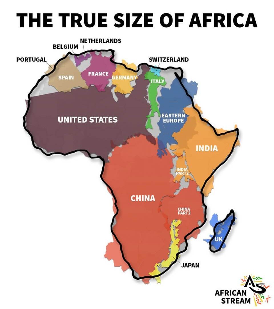
You’ve probably heard that the world map we’re used to seeing is skewed, with the proportions of global countries inaccurately portrayed. Russia, the USA, and the UK, for example, are always depicted as larger landmasses than they actually are.

By contrast, the African continent – which is almost two times the size of Russia – is granted far less space on standard maps than it should have. Now, the association that brings together Africa’s 55 countries, known as the African Union (AU), has joined a campaign called Correct the Map to call for change.

On its website, the campaign states: ‘For over 450 years, we have based our understanding of Africa, and the world, on a map that is wrong! In fact, you could fit the United States, China, India, Japan, Mexico and much of Europe into Africa and still have land to spare.’

It continues, ‘The Mercator map isn’t just about misrepresenting the size of the global South — it’s about power and perception. This needs to change.’

While the Mercator map’s creators probably didn’t mean to distort the size of the African continent – they prioritised the true distance and direction between continents over the size of continents to help ships navigate – this doesn’t mean its skewed portrayal hasn’t shaped our view and understanding of the world.

But because minimising directional distortion was the goal, the map ended up inflating the size of landmasses closest to the poles by a lot. Granted, this distortion would happen with any spherical object flattened in this way, but you can still understand why African leaders are unhappy with the outcome.

With Global North countries appearing larger than they are (the UK three times its size and the US four times larger its size), the idea that European nations deserved more power and domination over the world was more believable.

This representation, no doubt, helped to justify centuries of colonial and imperial conquests by Britain, France, Spain, and the like.

‘[The Mercator map] is the world’s longest misinformation and disinformation campaign, and it just simply has to stop,’ says Moky Makura, executive director of advocacy group Africa No Filter, in an interview with Reuters.

So, if the map we’ve come to know and recognise is problematic, what is the alternative?

The AU proposes use of the Equal Earth map created in 2018. This map provides more accuracy in terms of land mass because it retains the relative size of our planet’s land areas.

The Caribbean Community, an intergovernmental organisation that is a political and economic union of 15 member states including the Bahamas, Barbados, Guyana, and Jamaica, have also called for the wider adoption of the Equal Earth map in the past.

Still, despite its ability to more accurately portray the size of different land masses, the Equal Earth projection isn’t perfect. This depiction somewhat distorts the shape of continents, making them stretch along the longitude, albeit in a way that doesn’t make them unrecognisable.

Clearly clear no flat-laying map will ever be 100 percent perfect. But looking at Africa’s tumultuous history – a complete fault of inaccurately represented Global North powers – it’s not hard to understand the AU’s calls to decolonize the world map, once and for all.

Accessibility