


and it’s causing a fiery debate
Welcome to the latest edition of The Gen Zer. This week, we discuss the rising use of lowercase type in professional and educational settings. We also take a look at location tracking, run clubs, gun violence, and more . . .
![]()
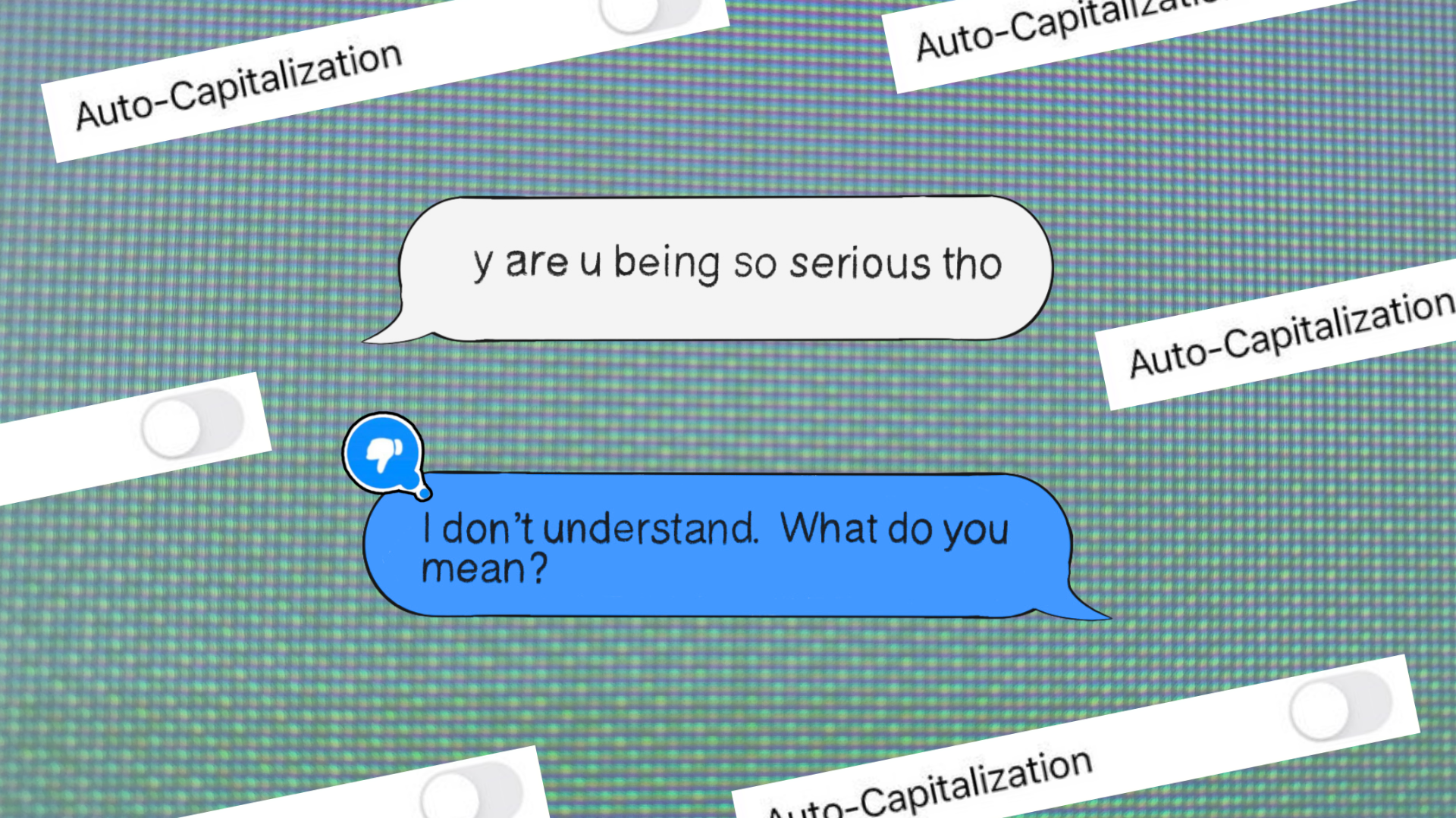
Growing up, my friends and I would always ask ‘are you mad?’ whenever one of us had added a period to the end of a text. According to an unwritten rule between us, the inclusion of a full stop meant, “I want this discussion to be over now” or at the very least added a layer of attitude and firmness to what the person had said. Seeing proper grammar used in such an informal method of communication (SMS, BBM, or MSN… am I showing my age?) seemed like the person was purposefully indicating the conversation should end there. Sometimes, it still does.
Over the past decade, a new stylistic preference for typing and texting has gripped the masses. Young smartphone users have turned off auto-capitalisation in their droves, thumbing messages, tweets, and Instagram captions in all lowercase. Though this style may have been initially noteworthy, it has since become an online norm. Hundreds of influencers and emerging brands now type in all lowercase online, while globally successful musicians including Billie Eilish, Ariana Grande, and Kendrick Lamar have communicated with their audiences this way for years, even releasing albums and songs entirely void of capital letters.
Lowercase type is everywhere – on the platforms we love, the brands we engage with, and the art we consume. Its clearly here to stay, but what exactly does it mean? And why is its sparking a heated debate amongst writers, professors, and friend groups?
The law of parsimony says that the simpler answer is usually the right one. Following that logic, the boom of lowercase type – especially when deployed from a desk/laptop – can be best explained by the ease it offers. Without taking the extra step to press the shift key, messages and comments can be composed faster, suiting the fast-paced nature of digital communication. This efficiency is particularly appealing on social media platforms and in DMs, where brevity and speed are desirable.
But if you really want to know why young people are manually switching off the autocaps feature on their smartphones, just ask them. I guarantee that many will tell you that their affinity for lowercase type is a deliberate tonal choice. According to Gen Z, the absence of capital letters conveys a casual friendliness that encourages informal, open conversation between peers and within wider digital communities. An intentional departure from traditional hierarchies which are far too serious, the use of lowercase type resonates with Gen Z’s values by levelling the playing field, fostering a sense of inclusivity, authenticity, and connection.
For companies and celebrities who have adopted the type form (rhode skin, lululemon, amazon among them), adopting the style has been a clever way to build a brand that appears approachable and relatable to consumers. Considering that brands are now expected to conjure a specific feeling, vibe, and set of values, the use of lowercase can be a tool to gain familiarity and trust that secures the spending power of young people.
So, with lowercase type now seen as neutral and welcoming, it makes sense that capitalisation has become the villain, seeming ‘stern’ or ‘abrupt’. This has left many young people to believe the use of capital letters should be reserved for educational, professional, and official circumstances only. In fact, many say they’ll still use capital letters in professional or academic settings, engaging a kind of code-switching that indicates that they see capital letters as a way to be taken more seriously. Some TikTok users say that switching their auto-capitalisation back on felt like a momentous day, declaring: Maturing is putting auto-caps back on. This makes sense for a generation that grew up online, where formal and informal communication are often blurred.
While popular in casual settings, the use of lowercase type has drawn criticism in academic and professional circles. Grade school teachers and university professors report having to correct students when capital letters have disappeared from coursework and essay submissions.
More recently, the use of lowercase type on Substack has even sparked a firey debate. A viral essay on the platform – with over 11k likes and 4k restacks – was written in all lowercase, much to the dismay of some readers. Ironically, the topic of the piece explored the rejection of anti-intellectualism, a juxtaposition that some have found issue with. They’ve brushed off essay-writing in all lowercase type as a purely ‘aesthetic’ choice that compromises the professionalism and readability of the content.
Critics say that lowercase typing makes formal writing appear unpolished, while detracting from the author’s credibility. They argue that adhering to traditional grammar and capitalisation rules is essential for maintaining the integrity, professionalism, and general readability of written work. Capital letters, they say, serve as visual cues that indicate the beginning of sentences and proper nouns, ultimately making texts clearer and organised. Without these cues, readers say it becomes necessarily challenging to navigate the content.
Those defending lowercase type find this interpretation and policing of grammar utterly ridiculous, suggesting that the use of otherwise correct grammar make it just as legible as if capitalisation was used. They add that lowercase type challenges established norms, democratises writing, and decolonising language by removing arbitrary rules. By opting for lowercase, writers can create a more egalitarian text, where the content is prioritised over the prominence of specific words or sections. An example of this approach is the esteemed authour bell hooks, who removed the capitalisation of her own name to allow her writing to take centre stage.
Amongst the worst (and most bitter-sounding) critiques of lowercase are suggestions that this stylistic choice is nothing but a strategy to tap into trendy, low stake forms of writing like Instagram captions and viral tweets written by teenage girls who are hoping to go viral. Not only is this interpretation vaguely misogynistic (though men who type in lowercase have been similarily scrutinised), it has also left a sour taste in people’s mouths.
It’s clear that the way we choose to communicate has major implications on how we are perceived – or maybe whether readers choose to perceive us at all. As this article points out, we all instinctively know that ‘I love you.’ and ‘luv u’ say the same thing but carry different weights – and the same goes for correct grammar use, evidently. But the question of whether lowercase typing detracts from the subject at hand will largely depend on who the reader is.
With everyday communication becoming more digital each year, it seems unlikely that lowercase type will disappear entirely. In fact, it seems that the use of lowercase type has firmly planted itself in the online realm with a general level of acceptance for good. Language (vocabulary, phrasing, and grammar) changes all the time – what makes lowercase writing any different?
See also: