Pantone has selected two colours it predicts will dominate the next year of culture, providing a platform to discuss social change within the arts – though it’s not without criticism.
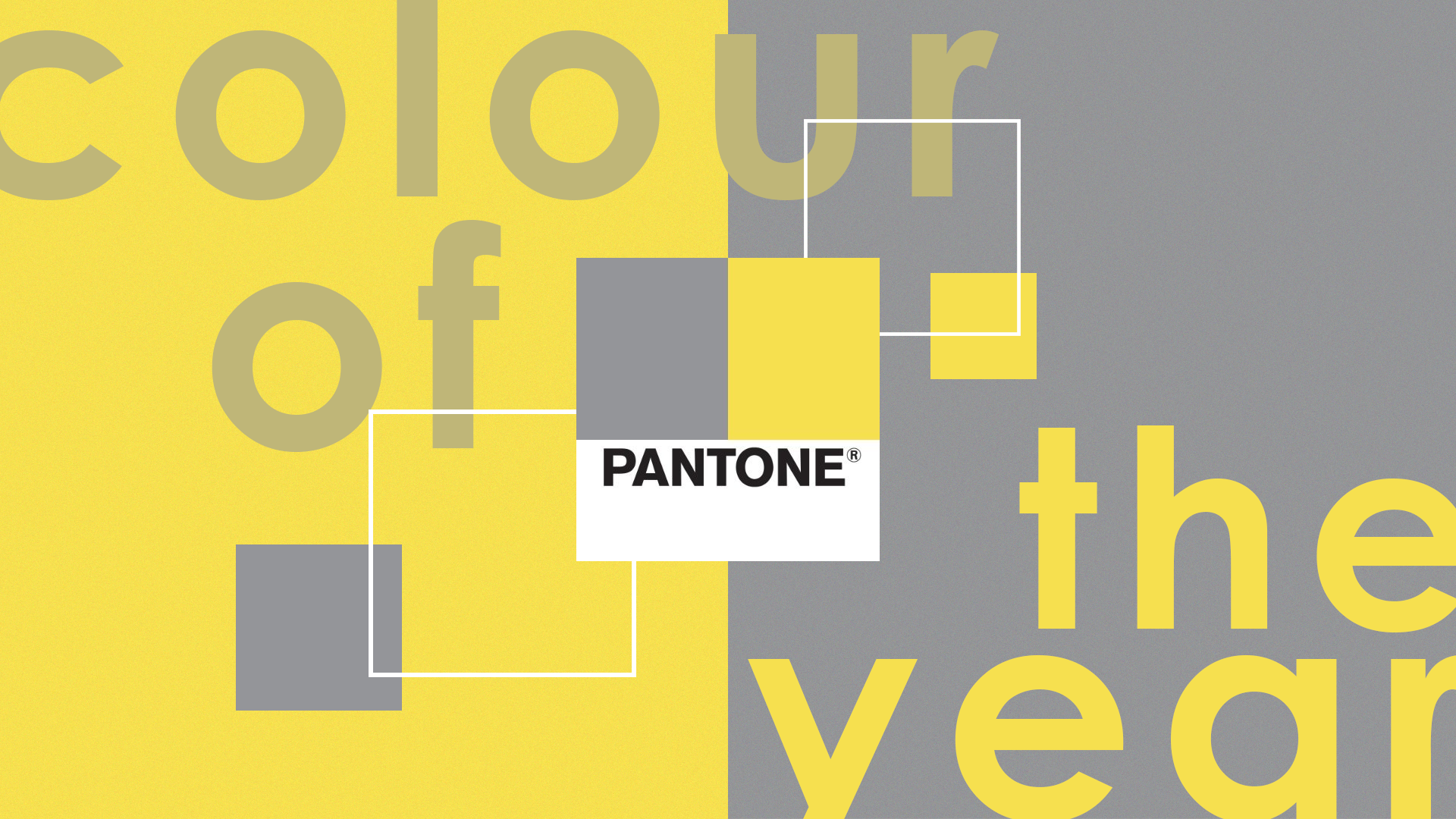
Pantone has just announced its official ‘Colour of the Year’ for 2021, a combination of both ‘Illuminating’ and ‘Ultimate Grey’.
The company selects a new colour (or in this case, two colours) every year that it thinks will best influence the following twelve months of product design and cultural change. A range of factors sway the final pick – Pantone employees spend months observing design evolution in products like clothes, kitchen layouts, and cars, and base their decision largely on consumption trends.
Quite often the colour represents far more than just product design, however, and provides an ideal opportunity to discuss social issues and particular moods of the moment. This year’s colours, for example, are intended to reflect a tremulous period of social isolation and the transition into a more hopeful future. As The New York Times notes, the colours embody the ‘light at the end of the tunnel’.
Why did Pantone pick Illuminating and Ultimate Grey?
In Pantone’s own words, the combination of yellow and grey is intended to portray a feeling of ‘happiness supported by fortitude’ that’s ‘aspirational’ and incites a feeling that ‘everything is going to get brighter’.
It’s probably not what you’d expect to come out of 2020, what with all the lockdowns, pandemics, protests, and political upheaval, but as vaccines begin to enter the public domain it seems we may have gotten through the worst. That’s the optimist in me speaking, at least.
Pantone also alludes to social activism causes like Black Lives Matter that occurred throughout 2020, stating that the colour pairing reflects ‘our innate need to be seen, to be visible, to be recognised, to have our voices heard’. Leatrice Eiseman, executive director of the Pantone Colour Institute, also adds that we ‘need to feel encouraged and uplifted’.
Dual colours probably seem a bit odd, but it’s not actually the first time it’s happened. 2016’s ‘Colour of the Year’ was both Rose Quartz and Serenity, which were selected to recognise an increasing blurring of gender norms and embrace fluidity.
Last year, ‘Classic Blue’ was chosen to acknowledge a ‘threshold into a new area’ with a focus on mental wellness, and a recent addition to Pantone’s official colour range – ‘Period Red’ – was introduced to encourage more conversation around women’s equality and dismantle old taboos around bodily functions.
Has the initiative ever faced criticism?
Pantone’s efforts haven’t been entirely void of nay-sayers, however.
Mixing blatant commercialism and consumption with social causes and public moods has rubbed some the wrong way in the past, and the entire initiative has been accused of being nothing more than a soulless cash grab that increases Pantone’s industry clout without contributing to a whole lot else. The New York Times last year questioned whether it was all to simply ‘sell a lot of stuff’.
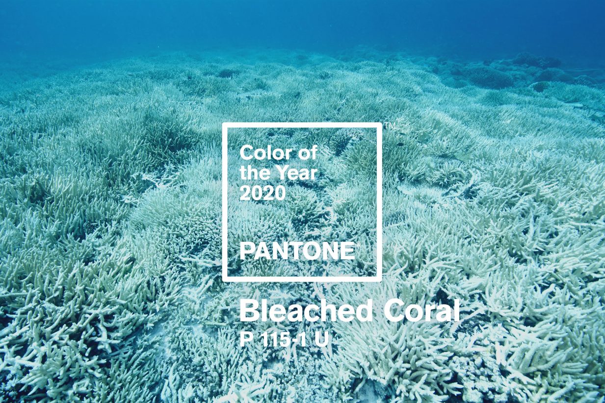
Australian designers suggested ‘Bleached Coral’ last year as a response to what they believed to be a ‘tone deaf’ pick from Pantone, accusing the company of being irresponsible and careless. It’s easy to see where these criticism come from; while Pantone’s colour picks help to reflect on the year’s events and societal changes, they are heavily branded and vague at best.
Still, Pantone’s industry influence continues to expand with each passing year, and you can bet we’ll see yellow and grey domestic products released in abundance throughout 2021. The key message to take away from this years’ pick is one of hope – regardless of whether or not you buy into Pantone.
And the more colours we see that break down gender norms and shake up the conversation around social change, the better. That’s worth everyone’s time.
I’m Charlie (He/Him), Deputy Editor and Senior Writer at Thred. I was previously the Editor full time at Thred before moving to Bristol in 2024. As a music and gaming enthusiast, I’m a nerd for pop culture. You can find me curating playlists, designing article headline images, and sipping cider on a Thursday. Follow me on LinkedIn and drop me some ideas/feedback via email.
Last weekend, the right-wing political organisation Turning Point hosted its own, alternative NFL Super Bowl LX halftime show in protest of Bad Bunny’s official stadium performance. The reviews were less than stellar.
Turning Point USA, a right-wing political organisation founded by the late Charlie Kirk, has faced criticism and ridicule for its ‘All-American Halftime Show’ during the NFL Super Bowl LX this past weekend.
Positioned as an ‘alternative’ to the...
Outspoken celebrities criticised the government and ICE amid ongoing demonstrations in the US. But the consensus on politicising award shows has never held.
By the time Bad Bunny won Album of The Year for his record DeBÍ TiRAR MáS FOToS at the 2026 Grammys, it had already become clear that this year’s event was unafraid to get political.
Unlike previous iterations of the awards, which have been dampened by snubs and...
This year’s biggest Grammys winners all hail from the same state-run Croydon school. Their stories are a ‘brilliant celebration’ of free arts education.
What do Olivia Dean, Raye, and Lola Young all have in common? Yes, they all won Grammys at this year’s awards, and yes, they all hail from London. But what’s most surprising is that they all studied at the same school in Croydon.
The BRIT school is a...
The Neom megaproject, first announced in 2017, involved an ambitious plan to build a megacity that ran entirely on renewable energy on the edge of a desert. The project is now being scaled back over financial and sustainability concerns.
Saudi Arabia’s futuristic city of Neom is officially in the process of being ‘significantly scaled back’.
First announced in 2017, the megaproject was touted as ushering in a futuristic era where...
We use cookies to ensure that we give you the best experience on our website. If you continue to use this site we will assume that you are happy with it.