


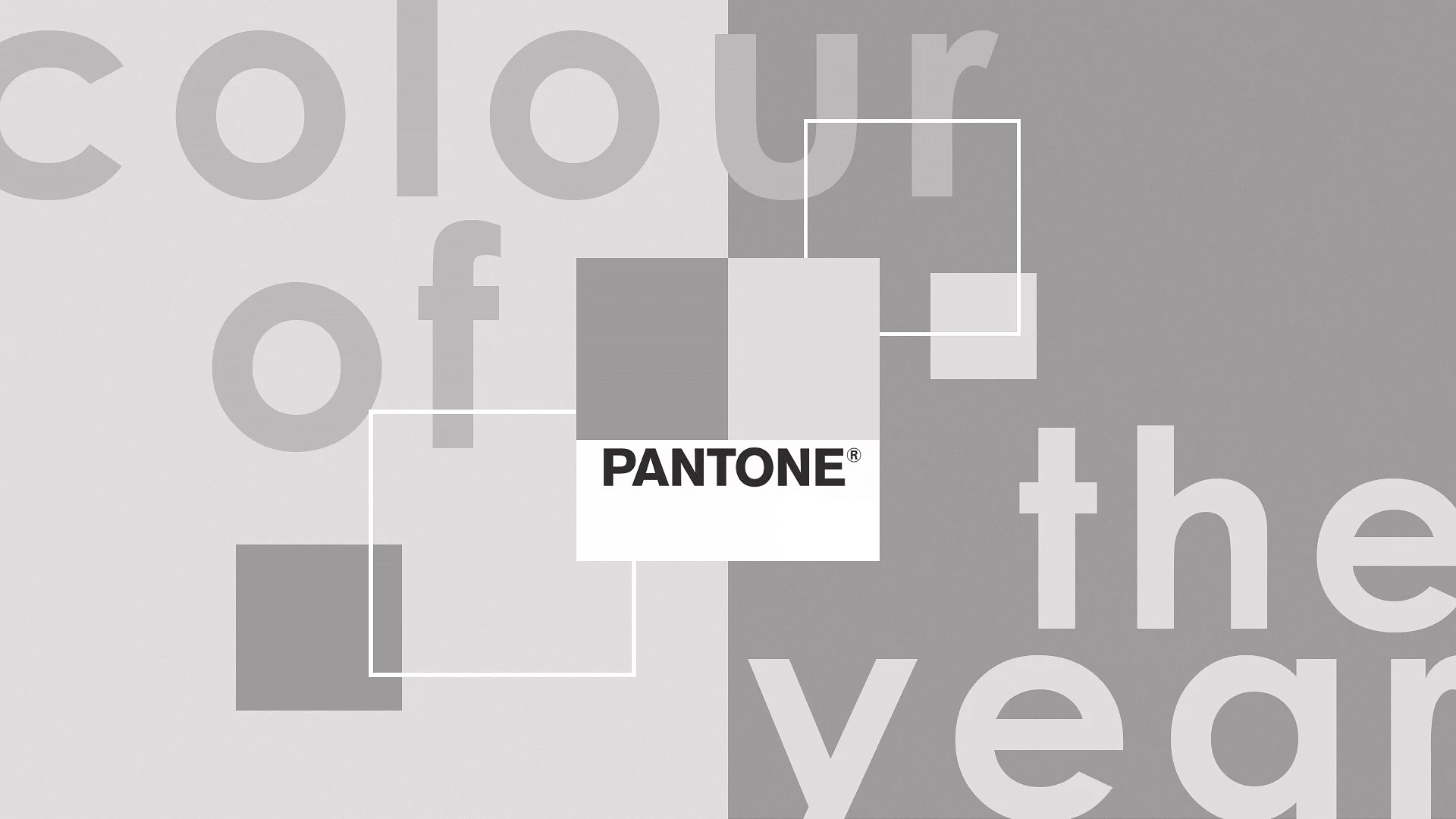
For the first time, a shade of white has been given the prestigious ‘Colour of the Year’ title by Pantone.
Every December, Pantone – a media company widely regarded as the mecca of colour theory – announces its annual ‘Colour of the Year’.
This title appears frivolous on the face of it, but it’s become a signpost of the year ahead – what trends might crop up in fashion, art and media. In many cases, Pantone’s decision goes on to shape the way we dress and decorate for the following 12 months. In other words: it’s a big deal.
As with anything as subjective as colour, the winning shade is often divisive. But 2025’s choice has been particularly contentious – not for its lurid tone or bright vivacious impact. Quite the opposite. For the first time, Pantone has chosen a shade of white as the colour du jour.
‘Cloud dancer’ is described as a ‘billowy balanced white’, a ‘key structural colour… allowing all colours to shine,’ according to Laurie Pressman, vice-president of Pantone Colour Institute. Fluff it up to your heart’s content, but really it’s just…white. How many ways are there to describe white? It is, by its very nature, a stark and empty shade.
It’s no surprise ‘cloud dancer’ has rubbed a few folks up the wrong way. Contrary to Pressman’s comment, many consider white to be the very absence of colour. Others consider it a boring and unusual choice, but one that’s apt for the era we’re living in. Given the mounting anxiety around tech replacing art, and the degradation of human creativity in the face of AI, white is a fitting if not disquieting choice.
Introducing the Pantone Color of the Year 2026: PANTONE 11-4201 Cloud Dancer. A neutral white that brings calm, clarity, and creative breath in a noisy world.
Discover the serenity of Cloud Dancer ↓https://t.co/Wvj4CkwefY#pantone #Coloroftheyear2026 #CloudDancer pic.twitter.com/6kbBU6OqlW— PANTONE (@pantone) December 4, 2025
On the flip side, ‘cloud dancer’ defenders argue the shade could be the calming presence we all need right now. Given Pantone’s colour choice sets the tone for the coming year, this isn’t too much of a stretch. But the notion that a blank shade of white could invoke instant ‘calm and comfort’ feels a bit on the nose.
‘It’s a long, deep exhale,’ writes Stylist’s Georgia Green, ‘a blank canvas to create calm, peace and unity.’ I’m not one to dismiss a person’s unique response to art, but this feels a tad overblown. Did someone task Green with describing the colour white in no less than 1000 words? There’s only so many ways you can make what is arguably the most unexciting colour sound at all interesting.
When it comes to ‘cloud dancer’ discourse, I’m in the camp that suspects Pantone might be trolling us. The aforementioned AI scare that’s shaping most modern industries – not least the creative kind – feels too obvious not to have informed the decision.
The brand says ‘cloud dancer’ is a ‘minimalist statement’, and shared the announcement with an animated image of a person dressed in white. Many suspect this was AI generated.