Menu Menu

The best entries in the World Illustration Awards

The World Illustration Awards provide a perfect platform for some of the very best talent in illustration. Get inspired with the top entries from this year’s competition.

Have you picked up the pen and pad recently? Illustration is one of the most accessible forms of expression out there, transcending language and providing a universal medium of communication.

From lost Soviet technology to gender equality, the best entries showcase the power of illustration – and why we all should dabble in drawing.

Have a gander at these impressive picks below, all of which were designed for books, magazines, and advertising. We’ve included links to each artist’s website if you’re eager to see more and you can check out the official World Illustration Awards website here.

Sarah Wilkins – Just Be Here; Profession children’s books category
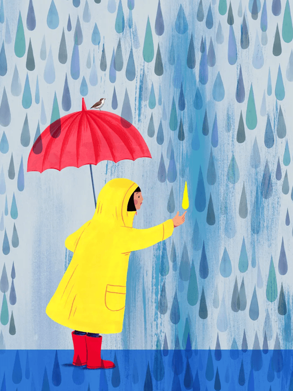
This piece has central themes of mindfulness and childlike play, with a focus on portraying the magnificence of everyday, seemingly uninteresting occurrences. Created by Sarah Wilkins for the book titled ‘Mindfulness for Children’, the bright yellow and reds of the girl’s attire contrasts heavily with the gentle blues of the backdrop and the rain.

When asked about her intentions, Wilkins commented that she ‘chose to illustrate the pleasure of walking in the rain’, which is reinforced by the single yellow raindrop that stands out amongst the rest.

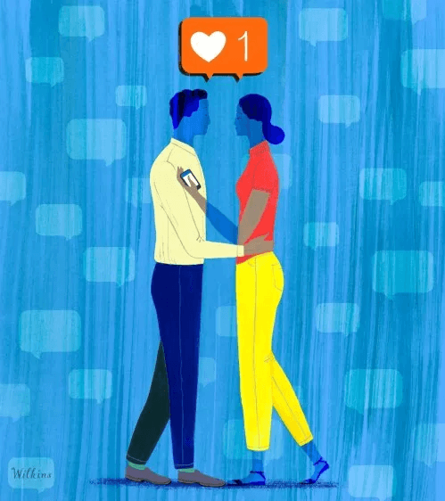
Wilkins often creates abstract pieces that feature side profiles of human beings interlaced with objects and geometry. She’s even dabbled in social media commentary – this work titled ‘Finding Love on Instagram’ being the most prominent example. This one works in its simplicity and makes for a fantastic image.
Nvard Yerkanyan – Soviet Modernist Architecture in Armenia; Research category

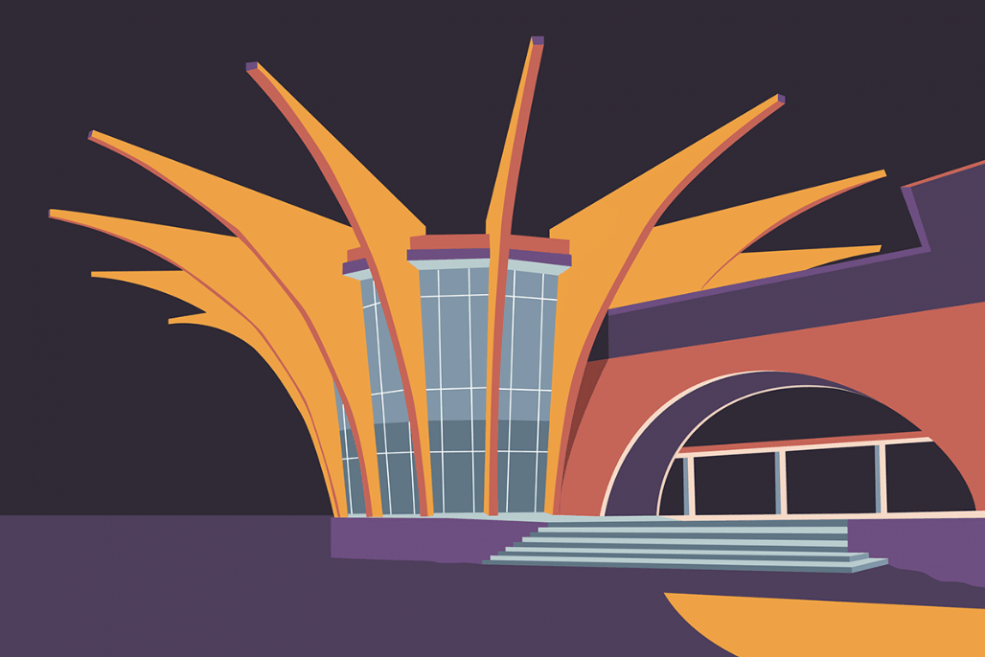
Nvard’s minimal style and contrasting, block colour aesthetic works very effectively in this piece that, according to the artist, depicts a viewing platform in Sevan. The main aim of the work is to highlight the ‘beauty of Soviet modernist architecture’, which Nvard believes is unfairly lost or undervalued.

His portfolio contains plenty of angular, spacious pieces that emphasise the jagged walls and windows of modern architecture. His personal website provides plenty more examples of his illustration – any of which could also be entered into this competition with ease.

Sonja Stangl – RAU. Winner of professional advertising category

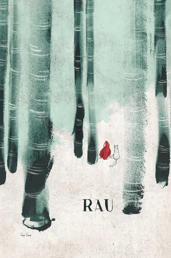
This one may look like an emotive, deeply personal piece, but Sonja actually created RAU. for an Austrian restaurant. The illustration immediately conjures up images of Little Red Riding Hood, as the trees tower above and surround the two figures.

The restaurant itself is situated on the edge of a natural reserve, and is hidden in a remote part of Austria. Stangl explained that she deliberately ‘combined wild inky strokes with fine, little characters’ to explicitly juxtapose the overwhelming might of the natural world compared to the delicate, relatively small size of living creatures.

You can view more of Sonja’s work here, which includes animated illustration as well as fine drawing and editorial works.

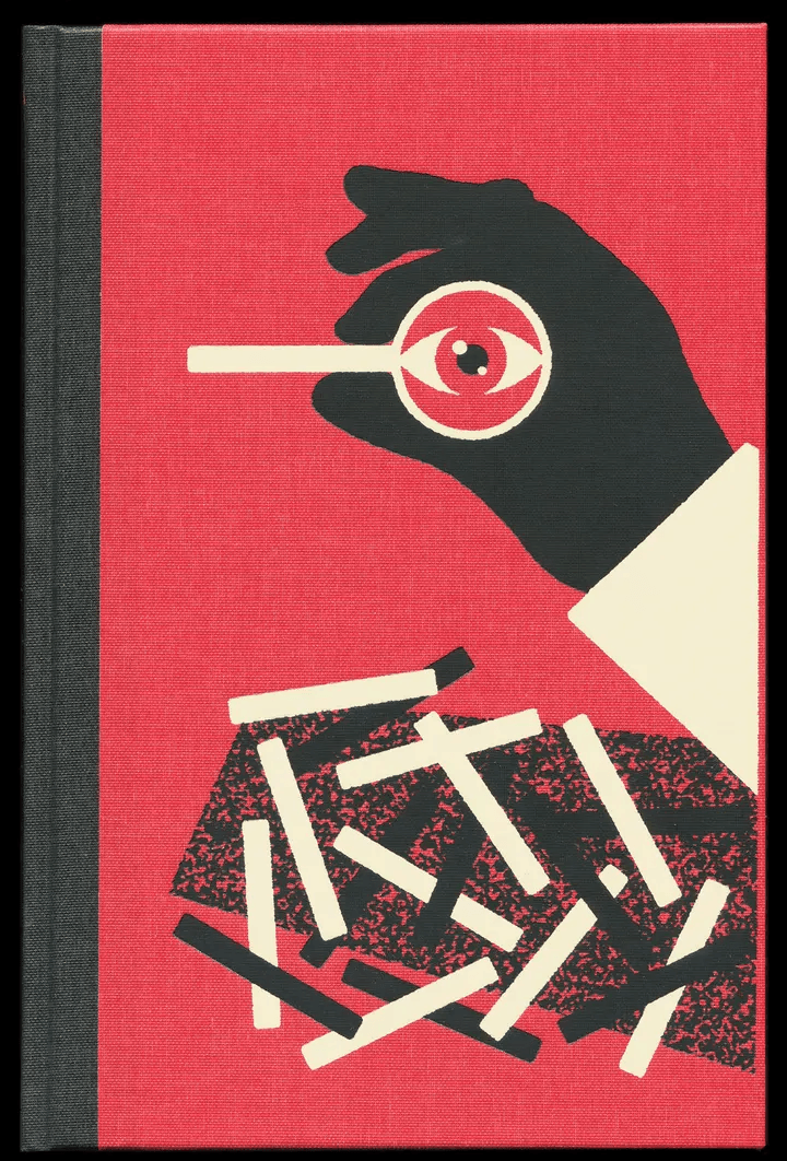
Max Loeffler – The Selected Memoirs of Sherlock Holmes; professional research category

While most of the work on show for this year’s competition is solely original, Max’s is unique in that it’s based on a well-established story. This piece was commissioned as a Sherlock Holmes book cover, and Max was eager to convey the ‘search for an impossible solution’ that he feels is the essence of the character.

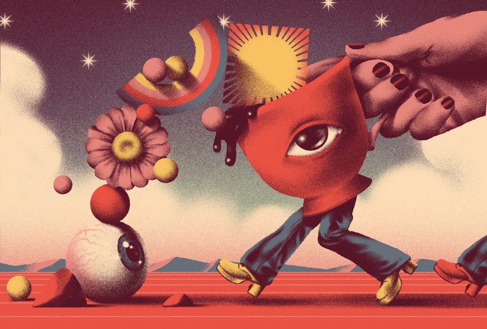
The magnifying glass is the central aspect of the work, with the scrambled bars on the lower half representing ‘[individual] cases [and] the search for a needle in a haystack’. You can view more of Max’s work here, some of which is more absurdist and bizarre. This was commissioned for GQ for an article on mental health, and features teacups with eyes.

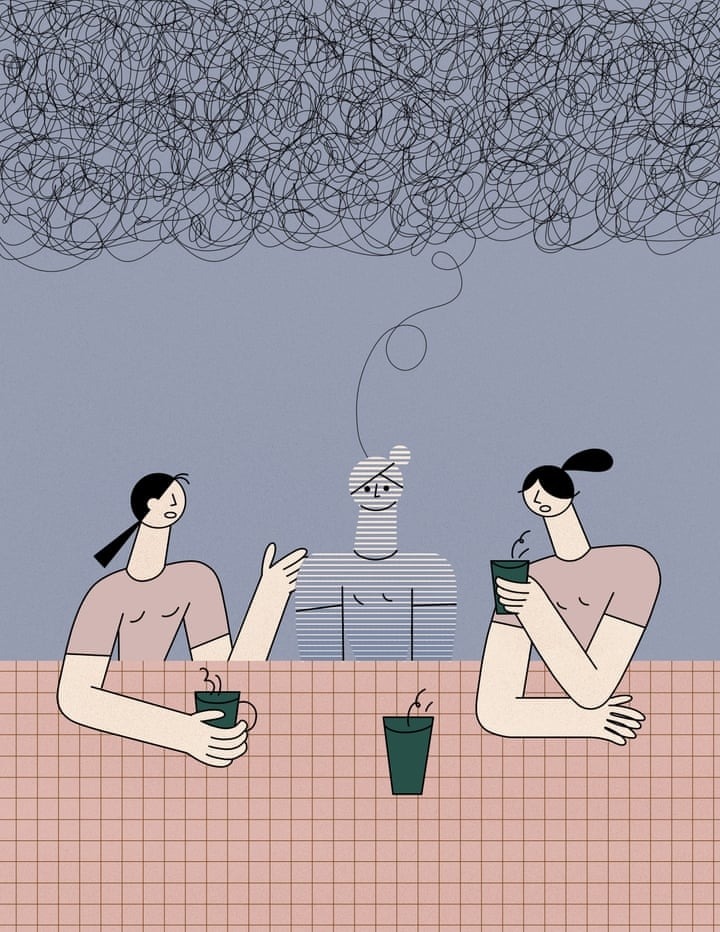
Lin Chen – ADD in Women; winner new talent editorial category

Designed for a piece on attention deficit disorder in women, Lin wanted to convey that it can feel as if you’re ‘alienated, lonely and not understood’. She also went on to say that women ‘look to each other as powerful sources of inspiration, guidance, support, and encouragement’.

Check out more of Lin’s work here. This first piece is part of a series, and her work uses a mix of carefully selected negative space, with bleeding colours loose around outlined objects. They’re very effective and particularly sleek.

Those are our top picks for this year’s entries, but you can view them all on the official website for the competition here. Which one is your favourite? Let us know in the comments below.

Accessibility